Check the below NCERT MCQ Class 11 Economics Chapter 4 Presentation of Data with Answers available with PDF free download. MCQ Questions for Class 11 Economics with Answers were prepared based on the latest syllabus and examination pattern issued by CBSE, NCERT and KVS. Our teachers have provided below Presentation of Data Class 11 Economics MCQs Questions with answers which will help students to revise and get more marks in exams
Presentation of Data Class 11 Economics MCQ Questions with Answers
Refer below for MCQ Class 11 Economics Chapter 4 Presentation of Data with solutions. Solve questions and compare with the answers provided below
Question. Histograms can be constructed under which of the following cases?
(a)When class intervals are equal
(b)When mid points are given
(c)When class intervals are unequal
(d) All of the above
Answer
D
Question. Frequency polygon can be drawn
(a) with histogram only
(b) without histogram only
(c) Both (a) and (b)
(d) Neither (a) nor (b)
Answer
C
Question. The adjustment factor in a histogram is equal to ……… .
(a)Width of the Class /Width of Highest Class
(b)Width of the Class /Width of Lowest Class
(c)Width of theLowestClass /Width of theClass
(d) None of the above
Answer
B
Question. On the basis of construction, which of the following are types of table?
(a) Simple table
(b) Complex table
(c) Derived table
(d) Both (a) and (b)
Answer
D
Question. Which of the following is/are the importance of diagrammatic presentation?
(a) Simple to understand
(b) Universal acceptance
(c) Used for locating positional averages
(d) All of the above
Answer
D
Question. The most accurate mode of presentation for comparison and computation is the …….. .
(a) diagram
(b) table
(c) text
(d) All of these
Answer
B
Question. Which of the following is/are type(s) of time series graphs?
(a) One variable graph
(b) Two or more variable graph
(c) Graphs of different units
(d) All of the above
Answer
D
Question. Which of the following is/are various shapes of frequency curve?
(a) J-shaped curve
(b) Reverse J-shaped curve
(c) U-shaped curve
(d) All of the above
Answer
D
Question. Degree of any component part of a pie-diagram is equal to
(a) (Component Value/Total Value) × 360
(b) (Component Value/Total Value) × 100
(c) (Total Value/Component Value) × 360
(d) (Total Value/Component Value) × 100
Answer
A
Question. Less than ogive curve starts from …… .
(a) origin
(b) maximum point
(c) minimum point
(d) None of the above
Answer
A
Question. More than ogive curve starts from …… .
(a) origin
(b) maximum point
(c) minimum point
(d) None of these
Answer
B
Question. Diagrammatic presentation is used as it is easy to remember diagram.
Choose from the options below.
(a) True
(b) False
(c) Partially true
(d) Incomplete statement
Answer
A
Question. Choose the correct pair from below.
| Column I | Column II |
| A. Deviation bar graph | (i) Cartograms |
| B. Squares | (ii) Two dimensional diagram |
| C. Blocks | (iii) Three dimensional diagram |
Codes
(a) A – (i)
(b) B – (ii)
(c) C – (iii)
(d) All of the above pairs are incorrect
Answer
C
Question. Graphical presentation is used to locate positional averages.
Choose from the options below.
(a) True
(b) False
(c) Partially true
(d) Incomplete statement
Answer
A
Question.In graphical presentation, data is presented in its accurate form.
Choose from the options below.
(a) True
(b) False
(c) Partially true
(d) Incomplete statement
Answer
B
Question. Which of the following are types of graphic distribution?
(i) Line frequency graph
(ii) Histogram
(iii) Frequency polygon
(iv) Frequency curve
(v) Cumulative frequency curve
Choose from the options below.
(a) (i), (ii), (iv), (v)
(b) (ii), (iii), (iv), (v)
(c) (i), (iii), (iv), (v)
(d) (i), (ii), (iii), (iv), (v)
Answer
D
Question. Choose the incorrect pair from given below.
| Column I Column II A. Line graph | Column II |
| A. Line graph | (i) Discrete series |
| B. Histogram | (ii) Continuous series |
| C. Ogive | (iii) Cumulative data |
Codes
(a) A – (i)
(b) B – (ii)
(c) C – (iii)
(d) All of the above pairs are correct
Answer
D
Question. A frequency polygon curve having its tail towards right side of the graph results in
(a) normal curve
(b) positively skewed curve
(c) negatively skewed curve
(d) None of the above
Answer
B
Question. As the number of observation and classes increase, the shape of a frequency polygon.
(a) Tends to become uneven
(b) Tends to become decreasing smooth
(c)tends to become increasing smooth
(d) stay the same
Answer
C
Question. In a table, Source and foot Note are the——— .
(a) Same
(b) Top
(c) Bottom
(d)Different
Answer
D
Question.Which of the following refer to geometric diagram of data presentation.
(a)Pie diagram
(b) Bar diagram
(c) Histogram
(c)Both (A)and (B)
Answer
D
Question. The stub is the contains…………
(a) Box head
(b) column caption
(c) Note
(d) Row caption
Answer
D
Question. Which of the following frequency should be used to obtain comparative measurements when the bases of histogram vary in their width.
(a)Absolute frequency
(b) Frequency density
(c) Cumulative Frequency
(d) Frequency curve
Answer
B
Question. classifications of data by attributes is called…?
(a) Qualitative classification
(b) Quantitative classification
(c) Temporal classification
(d) Spatial classification
Answer
B
Question. ———————— means exhibition of data in such a clear and attractive manner that these are easily understood and analysed.
(a)Presentation of data
(b)Interpretation of data
(c)Collection of data
(d) Analysis of data
Answer
A
Question. Point out the degree of an angle in the pie diagram .If Mohini spends 50% of her income on Education.
(a) 360̊
(b) 90 ̊
(c) 180̊
(d) 270̊
Answer
C
Question. Statistics data are generally presented in ……………….
(a) 1 form
(b) 2 Forms
(c) 3 forms
(d) 5 forms
Answer
C
Question. What does the total area under a frequency curve represents?
(a)Total Frequency
(b) Median
(c) Sample Size
(d) Both (A) and (C)
Answer
D
Question. In spatial classification data are classified on the basis of…..|
(a) Location
(b) Time
(c) Originality
(d) Height
Answer
A
Question. Which statistical measures can be determined with the help of ogives?
(a)Mean
(b) median
(c) Mode
(d) Mean Deviation
Answer
B
Question. What is shown at the X-axis of Time series graph .
(a) Income
(b) Expenditure
(c) Time
(d) percentage
Answer
C
Question. Which of the following Diagrams can be Made with the help of Histogram?
(a) Ogive
(b) Bar Diagram
(c) Frequency Polygon
(d) pie chart
Answer
C
Question. What is slope of More than ogive curve?
(a) Positive slope
(b) Negative slope
(c) parallel to X-axis
(d) parallel to Y-axis
Answer
B
Question. Datareprented through arithmetic line graph help in understanding.
(a) Periodicity
(b) Frequency Curve
(c) long term trend
(d) Both (A)and (C)
Answer
A
Question.The graph of a cumulative frequency distribution is called?
(a) Ogive
(b) frequency curve
(c) Arithmetic line graph
(d) Histogram
Answer
A
Question. In bar diagram, the bars that are presented are ————— from each other
(a)Equiwidth
(b) Equispaced
(c) Both (A) &(B)
(d) Unequal space
Answer
C
Question. If the upper limits of the classes and proceed by adding the frequencies that this method will be called……|
(a) More than ogive
(b) Less than ogive
(c) Frequency Curve
(d) both (A) and (B)
Answer
B
(a) Both Assertion (A) and Reason (R) are true and Reason (R) is the correct explanation of Assertion (A)
(b) Both Assertion (A) and Reason (R) are true,but Reason (R) is not the correct explanation of Assertion (A)
(c) Assertion (A) is false, but Reason (R) is true
(d) Both are false
Question. Assertion (A) Pie-charts are more useful means of presentation of data as compared to histograms.
Reason (R) Line graphs are used to draw both more than and less than ogive curves.
Answer
C
Question. Assertion (A) Tabulation of data procceedes classification.
Reason (R) In classification, data is arranged based upon varying attributes
of the statistics.
Answer
C
Question. Assertion (A) In the process of tabulation of data, title of the table should be self-explanatory.
Reason (R) Raw data presented in a tabular form organises the data to enhance understanding.
Answer
B
Question. Assertion (A) A proper proportion between the vertical axis and horizontal axis of the diagram should be marked.
Reason (R) Mathematically, dependent variables are measure on the Y-axis and independent variables on X-axis.
Answer
B
Question. Assertion (A) Simple bar graphs are drawn on a three dimensional plane.
Reason (R) Bar graphs can be either vertical or horizontal to represent same information.
Answer
C
Case Study Based MCQ Questions Presentation of Data Class 11 Economics

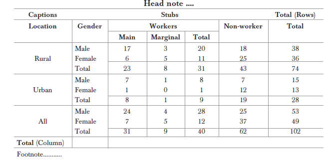
Question. Row headings are known as ………… .
(a) Stubs
(b) Columns
(c) Either (a) or (b)
(d) Neither (a) nor (b)
Answer
A
Question. Source of given information should be mentioned ……… the table.
(a) above
(b) below
(c) to the right
(d) to the left
Answer
B
Question. The above table is an example of
(a) simple table
(b) complex table
(c) derived table
(d) raw/original table
Answer
B
Question. Identify the error in the above table from the given below.
(i) Title not mentioned
(ii) Source is not given
(iii) Units are not mentioned
Choose from the options below.
(a) (i) and (ii)
(b) (ii) and (iii)
(c) (i) and (iii)
(d) All of these
Answer
D
Question. In the above table, location and gender are shown in captions. Choose from the options below.
(a) True
(b) False
(c) Partially true
(d) Incomplete statement
Answer
A

Answer
A
Question. Which of the following parts of the table is/are missing?
(a) Table no.
(b) Caption
(c) Source
(d) Both (a) and (c)
Answer
D
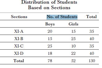
Question. Histogram cannot be used in the above case as the data is ……… .
(a) individual
(b) discrete
(c) continuous
(d) None of these
Answer
B
Question. Which type of diagrammatic presentation is most suitable in the above case?
(a) Simple bar graph
(b) Multiple bar graph
(c) Sub-divided bar graph
(d) Both (b) and (c)
Answer
D
Question. As per the above table, the total number of boys and girls are equal to
(a) 52
(b) 78
(c) 130
(d) None of these
Answer
B
Question. Which of the following is the stub of the given table?
(a) Sections
(b) No. of students
(c) Total
(d) Both (a) and (c)
Answer
B

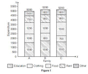
Question. Sub-divided bar graphs can be replaced by ………… bar graph.
(a) simple
(b) multiple
(c) Either (a) or (b)
(d) None of the above
Answer
B
Question. Which of the following type of graph is represented in Figure 2?
(a) Sub-divided bar graph
(b) Broken bar graph
(c) Percentage bar graph
(d) Deviation bar graph
Answer
D
Question. Which of the following type of graph is represented in Figure 1?
(a) Sub-divided bar graph
(b) Broken bar graph
(c) Percentage bar graph
(d) Deviation bar graph
Answer
A
Question. As per given Figure 1, which family has the lowest expenditure?
(a) Family A
(b) Family B
(c) Family C
(d) All families have similar income
Answer
A
Question. As per Figure 2, the bar below the origin shows
(a) profit
(b) loss
(c) surplus
(d) None of the above
Answer
B

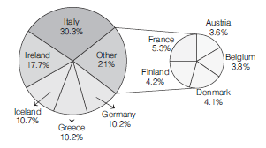
Question. Which country has the lowest degree share?
(a) Austria
(b) Denmark
(c) Finland
(d) Greece
Answer
A
Question. What is the degree share of Belgium?
(a) 3.8 degree
(b) 13.68 degree
(c) 14.62 degree
(d) 16.42 degree
Answer
A
Question. The segment used to represent the countries under the pie-diagram is known as ………… .
(a) Degree share
(b) Percent share
(c) Both (a) and (b)
(d) Neither (a) or (b)
Answer
A
Question. As per the data given above, which country has the highest degree share?
(a) Germany
(b) Italy
(c) Ireland
(d) None of the above
Answer
B
Question. .…… diagram is used when value of some variable is very high or low as compared to other values in the series.
(a) Pie-chart
(b) Histogram
(c) Bar graph
(d) Either (a) or (b)
Answer
D

We hope you liked MCQ Class 11 Economics Chapter 4 Presentation of Data with answers provided above. In case you have any questions please post them in the comments section below and our Economics teachers will provide a response.
